Considering the importance and position of Petro Pars Company in the oil industry inside and outside the country and comparing and competing with large and powerful companies and definitions obtained from this company On the sensitivity of the subject in the political and economic scene, its logo must be conscious، modern and calculated, and with all the principles and standards of symbolism in art and advertising, it has a special strength and strength، Inspired by the values of traditional and slime art in works such as tile, embossing, Khatam and past architecture and the use of geometric designs and forms، They can be a reflection of genuine national culture and art that is unique in the world.
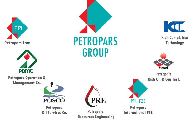
Simplifying and achieving a proportional composition in geometric form and form is one of the main acts that have been used to create unity and integrity of the logo. In the logo of Petropars, two things should be noted: Beauty and proportion in the work and executive and practical application that aims to achieve a perfect harmony in the image by observing the principles and foundations in the visual art، Proportionality in positive and negative spaces of static and balance in the whole set, creating contrast in color and form in order to intensify the factors used to make the design different from other logos and not having the same، Creating movement and direction by vertical right triangle, the equilateral use of the golden proportion of the 1/√2 between the components، creating dimension and perspective by the form and color of the composition and creating a proportional compartment between the square and the triangles، Harmony in Hindu and Indian lines due to the lack of curved and soft lines to make the subject of the sign more serious, the ability to execute one color and several colors in all cases as much as possible، Subject expression and a simple relationship between form and definition, reaching out to a compound set of factors determined briefly and abstractly، The use of two complementary and proportional colors to intensify the concepts assuming that the blue green color represents nature and raw materials and its representation is considered by a square source and extracted Harvesting and consuming this complex and creating energy by smaller triangles with red color in order to exit the whole and to harvest and direct the outward in the simplest possible form of the design so that nothing can be added to it and removed from it. Also, considering the shape and structure of structures, which are more than example connections, the expression of the subject has been used in this collection, which is symbolically summarized from the mast and the structure comes to the mind of the beholder.
The alignment of triangles with a static position next to a green square representing an oil field، The extraction of oil and gas is induced in a sterilized form, and the combination of Persian writing and simple and official Latin fonts adds to the seriousness of the sign.